Read
Read
Close
Drag
Currently Reading: Qube Design System
Qube Design System
Leveraging cross-functional constrained teams’ productivity through a consistent design library
Why do we need a design component library?
Since 2018, there has been talk about the importance of following a consistent design pattern and visual language for B2B products in the Qube product ecosystem. This is mainly because similar user groups will gonna use multiple products in our product suite. Another reason is the smaller size of the product engineering team that had to work on three different products. Our mission was to build a system that empowers the product engineering team to build the products consistently and effortlessly.
My Role
I collaborated with my senior ux designer and started this as a side project. Then eventually we convinced to organization pick this as a full fledged organization wide interface language revamp. I audited the existing components and tokens and came up with fresh set of scalable design library. Experimented few scripting of Figma plugin for design automation process. Also collaborated with developers in testing the developed component.
Product Team
1 UX Designer (Myself)
1 Senior UX Designer
1 Product Manager
Engineering Team
2 Front End Developers for tokens and components
Respective product's developers for building their own templates
1 QA Analyst
Duration
Nov 2019 - Feb 2020
Before the project [3 products with three different visual patterns]
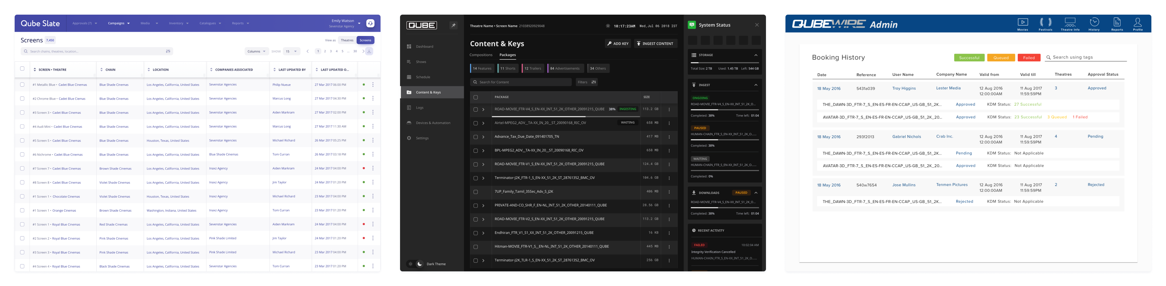
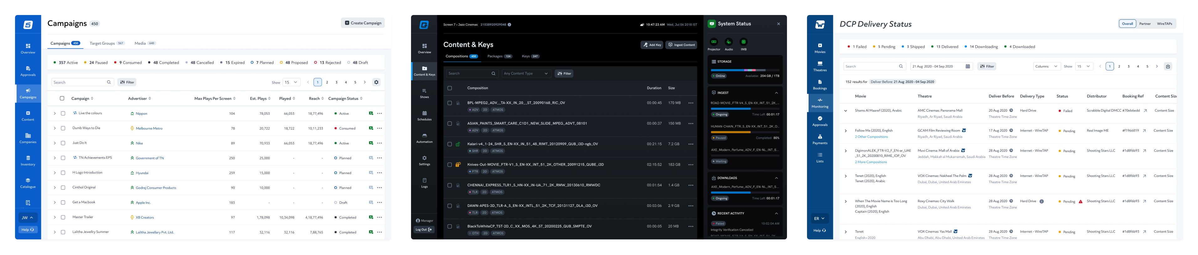
After the project [3 products with consistent visual patterns]
With the team of two designers working on these 3 products, we were able to maintain consistency across each of these products individually but not on the whole for the entire product suite. With Sketch being our product design tool along with Abstract, the version control tool we tried to minimize the inconsistency and be as collaborative as possible. At that time, a handful of new tools were gaining popularity and one such tool was Figma. We continuously monitored their development.
Collaborative
Working Experience
Flexible
Component Management
80%
Reduced Cost
Figma made the company wide design system possible with its features, and it was easier to manage than Sketch. With so many benefits, both feature-wise and cost wise, we took the decision to migrate to Figma.
01
Auditing the existing components
The migration phase started with auditing the existing components that our team was already using.
Inconsistent Design tokens
We realised that the system we had built lacked scalability. We couldn’t extend it to multiple products and there were no defined rules for naming and organisation. Furthermore, the usage of text and color token was inconsistent. Our icon set had lots of duplicates with different names. 
Incomplete building blocks
The next important discovery during auditing was that we stopped with defining only atoms and partly molecules and started designing the user interface. The concept of organisms and templates were not implemented much and that was also one of the reasons for the inconsistency.
Different UX Patterns for same problem
We also found that we used different UX patterns for the same type of user problem. This made it difficult for the Users to understand and process them. For example, we used the card and table layout for the same kind of data. Later, we found that, the table-based layout was more handy to the user in most of the enterprise applications and this is mainly because of their expertise in the usage of spreadsheet-based tools. We also properly defined the scenarios for which we would need to use the card layouts.
Inconsistent mock data
Although we were able to follow consistent mock data for a single user flow, we were not able to achieve correlation between mock data across different features of the product. Because of that, validation across flows and presentation of the screens became quite difficult.
02
Defining Tokens
We started from the ground up by defining the tokens.
Colors
The colors that would be used across all the products in Qube, such as shades of grey, red, amber and green were defined and we ensured the contrast ratio was good. Our product suite followed the school of blue color with different hues. So we defined product-specific colors and their shades. We handpicked different shades of a color that could be used in both the light theme and the dark theme of our products.
Providing description for colors helped us search and find the right color based on the requirement
Spacing
For the spacing, we followed a 4-point grid system. Our apps were data dense and so we needed a granular spacing scale. So, a 4-point grid system was a no brainer. We also set up spacing rules that specified when to use what values. Setting up this grid system and spacing rules also meant that it was easier for both the devs and developers to uniformly decide the spacing between elements and the spacing within containers. Because of this, we were able to achieve a good vertical tempo in the box model. And with this, the elements were packed in a way that was neither too tight nor spaced out but hit the sweet spot. We also defined certain cases where the rules could be broken to achieve better visual harmony.
Typography
For the typography, we categorized it into three common groups, namely heading, paragraph and action text. Under each of these, we defined the font sizes and weights that needed to be used. We ensured that the font sizes and line heights that we chose adhered to the 4-point grid system and the spacing that we defined. This drastically reduced the number of text styles being used. We believed that categorisation would help us maintain the text styles better in the long run.
Icons
With the limited number of designers and no separate team for visual design, we did not have enough time to design icons from scratch. So we used icons from open sources such as SF Symbols by Apple and Material Icons by Google. We fine-tuned the icons to meet our product style and ensured that the size, weight and spacing of all the icons were consistent in its school. While migrating from sketch to Figma, we also followed proper naming convention for similar icons.
With all the basic tokens set, the job was 25% done from our side. Then we started building components.
03
Component Creation
We created one common library for components named Qube Core Components that encompassed the structure/skeleton of most of the common components used across all the products in our suite. Then each individual product had its own library inherited from "Qube Core Components" along with their own product-specific components. This gave us the flexibility to stylize the components based on the product without compromising the core component's structures.
We looked at the components we had in Sketch and translated them into the core library in Figma in a structured manner with proper spacing, consistent naming and responsive constraints. One such example is illustrated below.
Then we created product-specific variations from the core components. Basic components could either be atoms or molecules as there is only a fine line between the two. Some of the examples include buttons, inputs field, toggles, drop-down lists, navigation tabs, tags, search bars, etc.
300 Variations
from 9 core button components
25 Variations
from 7 core input field components
60 Variations
from 3 core tag components
Layout, templates and other patterns
One of the important areas to be addressed was the navigation pattern. Previously, we had the primary navigation bar of the app in the top section. However, with our information architecture, we found it difficult to scale up as new nav items came in. So we decided to move to the left navbar, which would be scrollable as the nav items increased. We also logically grouped the nav items so that the not so important sections can be collapsed.
Navigation Bar Change
Page Layout
With the top navigation bar moved to the left side, the breadcrumbs and the page header had some breathing space. So we designed a more scalable header component with elements that could be added or removed without comprising the core structure of the header.
We used a side drawer (right pane) pattern for other data addition and edit functionality.
Data Tables and its component
The most important pattern in our design library was the table. Before getting into building the table layout, we analysed the best practise for table design and looked out for ways to use it more effectively. So functionalities such as fixed headers, column sort, adjustable column width, rearranging columns, hide/show columns, drag row, expand/collapse rows, bulk actions were taken into consideration. The table layout was organised in such a way to accommodate all of these functionalities and yet provide a clear and concise experience to the user.
Tables are made up of cells and these cells have different kinds of data. So we made different components for each of these cell types. . Some of the table components include text-only cells, text with icon cells, cells with only numbers, dual text cells, actionable cells and so on. We kept the table simple by allowing only data display. We restricted the option to enter/edit data within the table. This is mainly because there can be multiple data in one cell and also because we had the option to show/hide columns, which would lead to confusion while editing. However, editing the content of the cells was made possible by providing the data in the right panel.
Check the table component in Figma Community
04
Design-Handoff
All the tokens such as colors, spacing and typography are defined as variables, which are then assigned to the actual component itself. This ensured that no other independent color shades, text sizes or spacing values were used anywhere in the document. This by itself cleaned up the user interface to a large extent.

But the real deal was using the Storybook for reviewing and documenting the components built by the devs. So it became the single source of truth of all the components used in the UI. This way dev handoff and review of design components built become a lot easier. Developers getting access to our Figma files also made life a lot easier because the structuring that we had done in Figma with all the responsive constraints was almost always the same that was going to be translated into code. So the devs leveraged that and followed the grouping and alignment that we have done in the design. This reduced a lot of the time the devs spent figuring out how to go about structuring the layout divs.
Improved Productivity with Plugins
Apart from consistency, scalability and collaborative nature of Figma, the community support and contribution was also commendable. We used a lot of plugins to increase productivity. For instance, we used the Google Sheets Sync plugin to solve the problem of inconsistent mock data. With this plugin, the content team got their hands on the tools that they were familiar and we got a single-source truth for data that was easily manageable.

During the whole design system building process, there were changes/improvements that would include time-consuming manual work. With the help of Figma plugin Scripter, we wrote some scripts for automating many of the repetitive mundane tasks. This was definitely a life saver especially for a very small team like ours.
Many components needed updates and additions to them based on new use cases. This meant that we had to create a new component that had only a slight difference just so that the existing ones are not affected or we had to go update all existing instances which is time consuming. . So we wrote a script to hide the new additions or updates to existing instances of the components. Later it was published into an independent Figma community plugin - Hide Layer from Instances
Hidel Layer from Instances
For switching between dark and light themes using a single set of color styles
To sum up, with a constrained team, we always found solutions to automate our workflow and achieve the results much quicker and efficient.
Overall
With all these, two designers (myself and Manikandan) improved our productivity by 3x and were able to design 800+ screens in a very short span of time. We did not just improve our workflow, our work on the design system pushed the devs to optimise and set up their workflows in a much better way. We also made the design-dev collaboration a lot smoother and more effective and reduced the feedback loop to a greater extent. This also enabled us to spend more time in the actual problem solving part of design rather than worrying about design components and patterns.

As far as the design system is concerned, it has been a trustable experience that all the engineers and product managers have had by understanding its importance and value.